You are currently not signed in.

Please sign in or register.

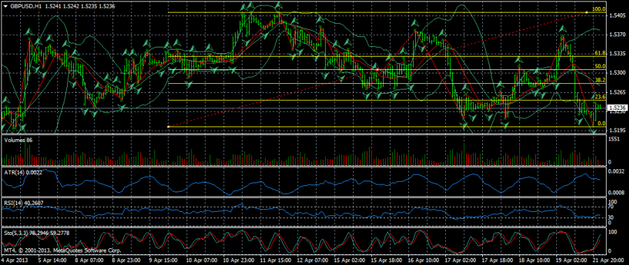
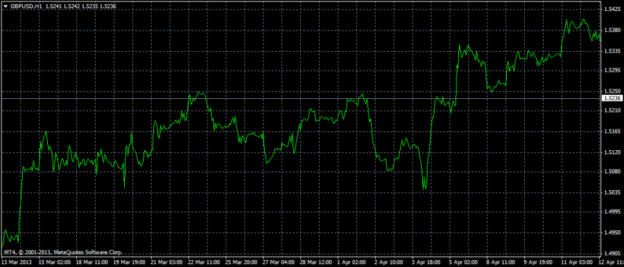
"Messy chart" vs "Just Chart"

页数: 1
Jul 16, 2013 11:44 am
#1
Sasha User

帖子: 836
入会日期: 16/05/2011

Which one do u like

Attachements:


Jul 17, 2013 01:01 pm

帖子: 64
入会日期: 17/05/2013

I like the messy, more sophisticated and looks nice.

http://www.fxstat.com/widget/link?t=tiny&c=7&s=28807&o1=growth&o2=drawdown&o3=monthly&o4=equity

Jul 17, 2013 07:31 pm
Champ User

帖子: 711
入会日期: 17/05/2011

Hehehe. Can it be a little less messy :D

Well.. I use indicators but not this many. This chart is extra messy

http://www.fxstat.com/widget/link?t=tiny&c=1&s=24959&o1=growth&o2=drawdown&o3=profitfactor

Jul 18, 2013 08:30 pm

帖子: 939
入会日期: 21/04/2011

Diagram 2 is very clean and much more readable to me. But I think addition of manual trend lines or MAs would give a better idea.

Stick to your rules

页数: 1